Explore! Worldwide Case Study
As part of my Media Campaigns class, I chose an established brand and redesigned it. I chose Explore! Worldwide, a sustainable travel agency based in the UK, because I believed their updated logo did not fully express their adventurous brand.
Company History
Their story began in 1981 when their founders, Travers Cox and Derek Moore, were inspired to create a travel company that focused on immersive and sustainable travel experiences. They started by offering six trips in their four-page brochure and have since ballooned to offer over 350 trips to over 100 countries. The company offers solo or small group travel options that foster genuine connections and local experiences that minimize your carbon footprint.
With their values rooted in sustainability efforts, Explore has taken several steps to uphold these values. In 2008, Explore started offsetting all customer flights with Cool Earth, a nonprofit organization that focuses on rainforest conservation, to assist indigenous peoples in protecting rainforests. By 2020, all trips were fully carbon offset, earning them the B Corp Certification in 2024. Today, Explore continues to offer sustainable, once-in-a-lifetime experiences across the globe and is actively searching for new ways to better the planet.
Recently, Explore has updated their logo saying that their previous branding did not encompass their adventurous spirit, featuring hand drawn elements to reflect their human tone and nature. Their goal with their rebranding was to be fresh, personal and less formal.

Original Logo
Brand Updated Logo
SWOT Analysis
Strengths
- Simple, clean design
- The logo has elements that encompass their values
- “x” is hand-drawn, speaking to their human interactions and storytelling
- Less formal fonts and a color palette that speaks to the brand personality
- Consistent use of visuals across all touch points
Weaknesses
- Yellow in the color palette can be hard to read
- Favicon is not unique to Explore! and can be mistaken for E! News
- Lacks texture; Explore! is adventurous and a brand not afraid to take the unconventional route; Warmth is lost in the visual identity
- “x” is the only unique icon; Brand identity can be lost across industries
Opportunities
- Adjusted color palette for easier visibility
- Updated favicon that communicates the brand industry
- Added texture and depth to visuals that show the brand’s adventurous side
- Graphics that are industry-related
Threats
- Branding may be too casual for consumers seeking luxury adventure experiences
- Handwritten text or symbols may become distorted or blurry on various platforms
- Casual design is not timeless and may need to be updated over time
Challenge
Explore needed branding that communicated their adventurous, human nature while being simple enough to be utilized for years to come.
Solution
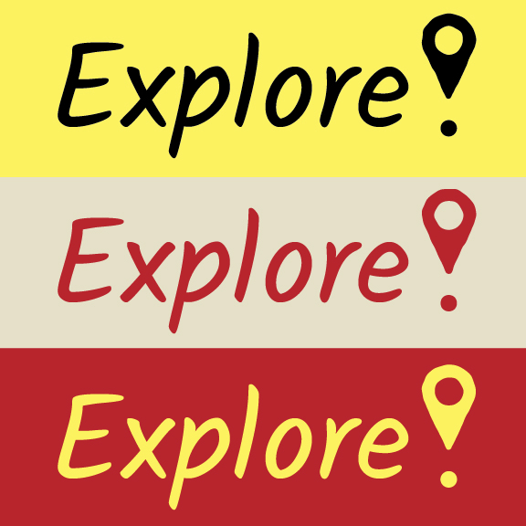
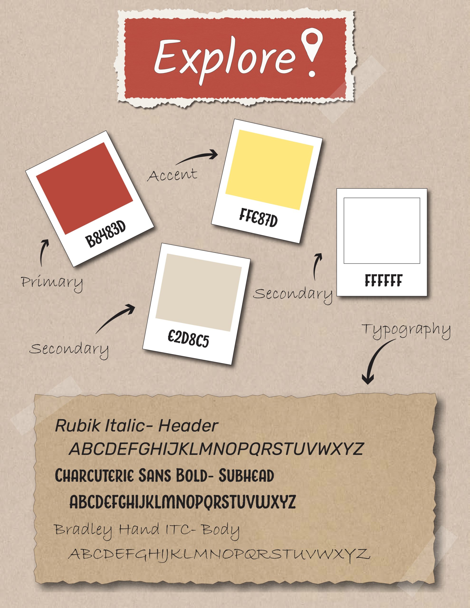
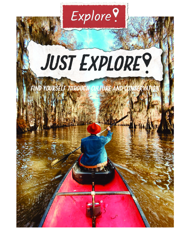
After designing several concepts, I decided that their updated branding should feel as though the viewer is looking at an explorer’s adventure journal. The updated logo expands the hand-drawn aspect to the entirety of the logo, giving the brand that “less formal” look they are seeking. I also added a textured location pin in place of the exclamation point that speaks to their industry. This location pin will also act as their Favicon, giving the brand a fresh and unique brand identity. Their updated palette is easier to read, and the typography follows the hand-drawn graphics.


